Interaction design · Mobile app
Nomic, budgeting made for students.
A digital service that turns budgeting from something confusing and time-consuming into a few simple, guided steps.
The brief
Help students make smart money choices
The startup ACME wanted a digital service that helps students save money, using the opportunities opened up by PSD2, an EU directive letting non-banks read account data and move money on the customer’s behalf.
We ran the research, ideation and concept work in groups of four. During the exam period I carried the concept on individually and made the changes I wanted.
Research
Listening to how students really save
We mapped PSD2 and the mobile banks already on the market, then ran qualitative interviews and two online surveys. A clear gap appeared: students want to save, but very few keep a budget, often because they didn’t know how to set one up.
90
students surveyed, ages 19 to 31
40%
had never set up a budget
95.5%
check their mobile bank daily or weekly
80%
would use an app that helped set a budget
Who we’re designing for
Three students, three relationships with money
Spendthrift Sara
20 · Oslo
A social spender who loves cafés and nights out, needs help staying social without the worry.
Frugal Gjermund
25 · Oslo
Careful with money and always packs lunch, wants efficient tools and a clear overview.
Average Ada
22 · Asker
Commutes, lives at home, needs something low-effort that fits an ordinary student life.
Problem statement
How might we design a digital solution that helps students keep a budget, so they gain control over their finances and build good habits for the future?
Idea & concept
Four directions, one focused concept
We brainstormed, voted on favourites, and landed on four possible directions. I carried two forward, combining the everyday “small things” insight with a flow that works for beginners and pros alike.
Content structure
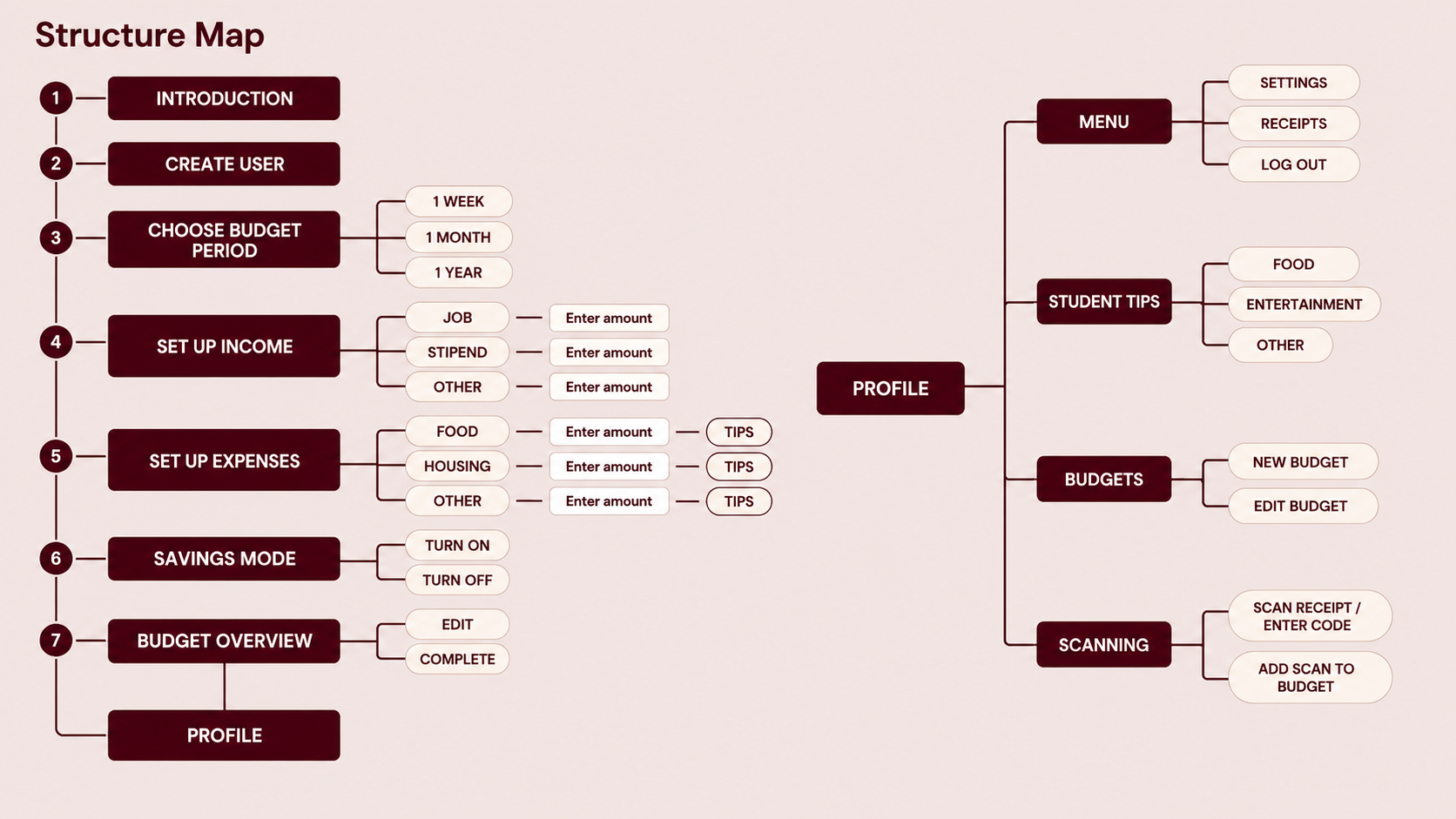
Mapping the flow before wireframing
Early sketches
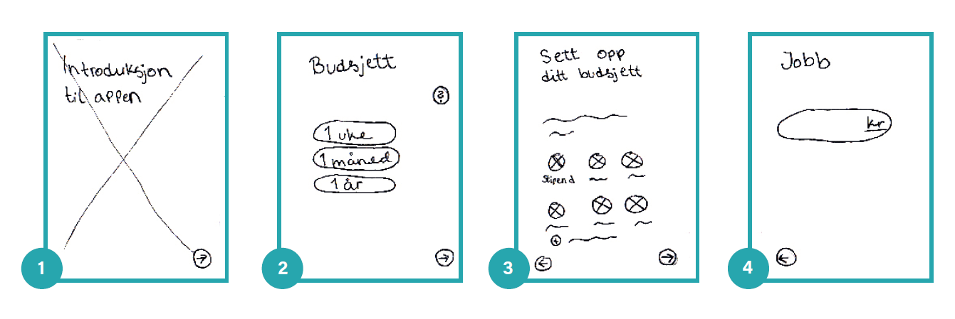
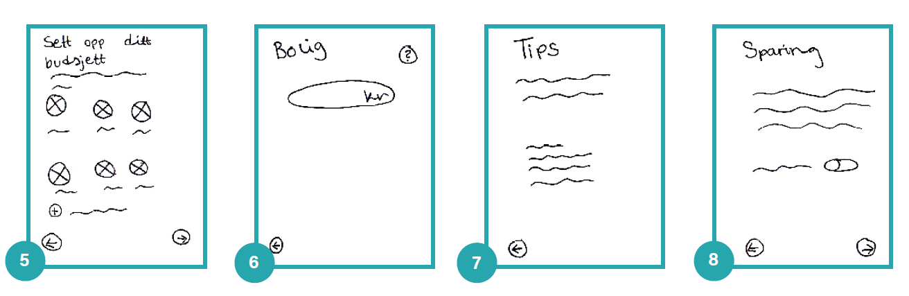
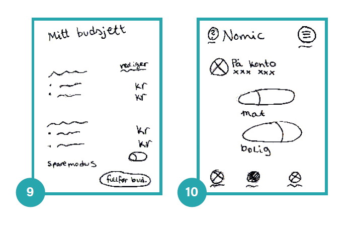
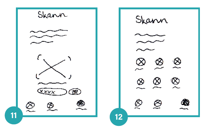
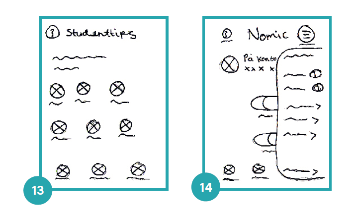
Storyboard and paper wireframes
Prototype & testing
Test, listen, refine
We tested the prototype with five students, same tasks for each, talking as little as possible so they’d think out loud. Real changes followed:
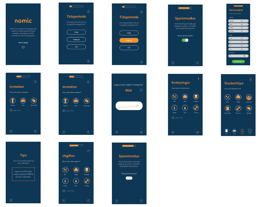
Automatic time step. Users hesitated at “tap 1 month, then tap next”, so the choice now advances on its own.
Less back and forth. Income and expenses felt repetitive, so all edits now happen on one page.
Clearer tap targets. Removed circles from non-clickable icons and added an oval field for typed amounts.
Readable progress. Swapped the plain bar for a stepped one, plus a “what happens next” page.
“When is this coming to the App Store?”
tester, 20, political science
The group prototype, before my individual exam-period changes.
Independent exam-period revision
Taking Nomic further on my own
After the group project ended, I continued developing Nomic independently during the exam period, focused on flow, wording and a visual refresh so the app would feel less like onboarding-only and more like a complete product.
Beyond onboarding. Added a finished-budget screen and two new steps for connecting bank accounts and cards, since the group version stopped short of showing what happens after setup.
Clearer naming. Renamed “Profile” to “My overview” and “Budgets” to “My budget” after testers expected personal settings, not a financial summary, under “Profile.”
New features. A dedicated food-budget bank card, student discounts inside the tips section, shortcuts from the overview page, a statistics view, and an expanded hamburger menu.
Removed conflicting icons. Dropped the question-mark help icons scattered through onboarding, they visually clashed with the tips icon and testing showed the app already explained itself.
The palette moved to a warmer gradient (#FE4570 → #FF6560), balanced with off-white and black so the app would read as modern and fresh rather than purely functional, while staying legible and calm around dense budget numbers.
The visual system
A warm gradient, built for trust
During the exam period I moved Nomic’s main colour to a gradient of #FE4570 to #FF6560, with a flat #FF5C65 used wherever a gradient wasn’t practical. Both are paired with #FAFAFA and #000000, and in-app text is set in black and red. The gradient itself appears on the app icon and on the intro and congratulations screens.
It reads as more modern and fresh than the earlier blue-and-orange version, while staying calm enough around dense budget numbers. Nomic blends “economic” and “ergonomic,” signalling both financial benefit and ease of use. Screen labels stay plain, My budget, Scan, Student tips, My overview, so nobody has to stop and think.
The result
A budget in a few guided steps
Swipe to browse the finished app →
1–4: Nomic sits as an app icon like any other. First launch greets you with an intro screen, then you choose the budget period, one week, one month or one year.
5–8: Enter income by tapping an icon (stipend, job, allowance), type the amount and save, then move on to expenses the same way.
9–11: A question mark next to any expense opens tips on typical spending, so unsure users have a reference point.
12–15: A tip on food spending, then adding a bank account or card, and turning on savings mode to auto-transfer what's left each month.
16–19: A final review of everything entered, a congratulations screen, then the finished overview page with the active tab highlighted.
22–24: Student tips by category, the hamburger menu with shortcuts to receipts, statistics and settings, and the “My budget” editing page.
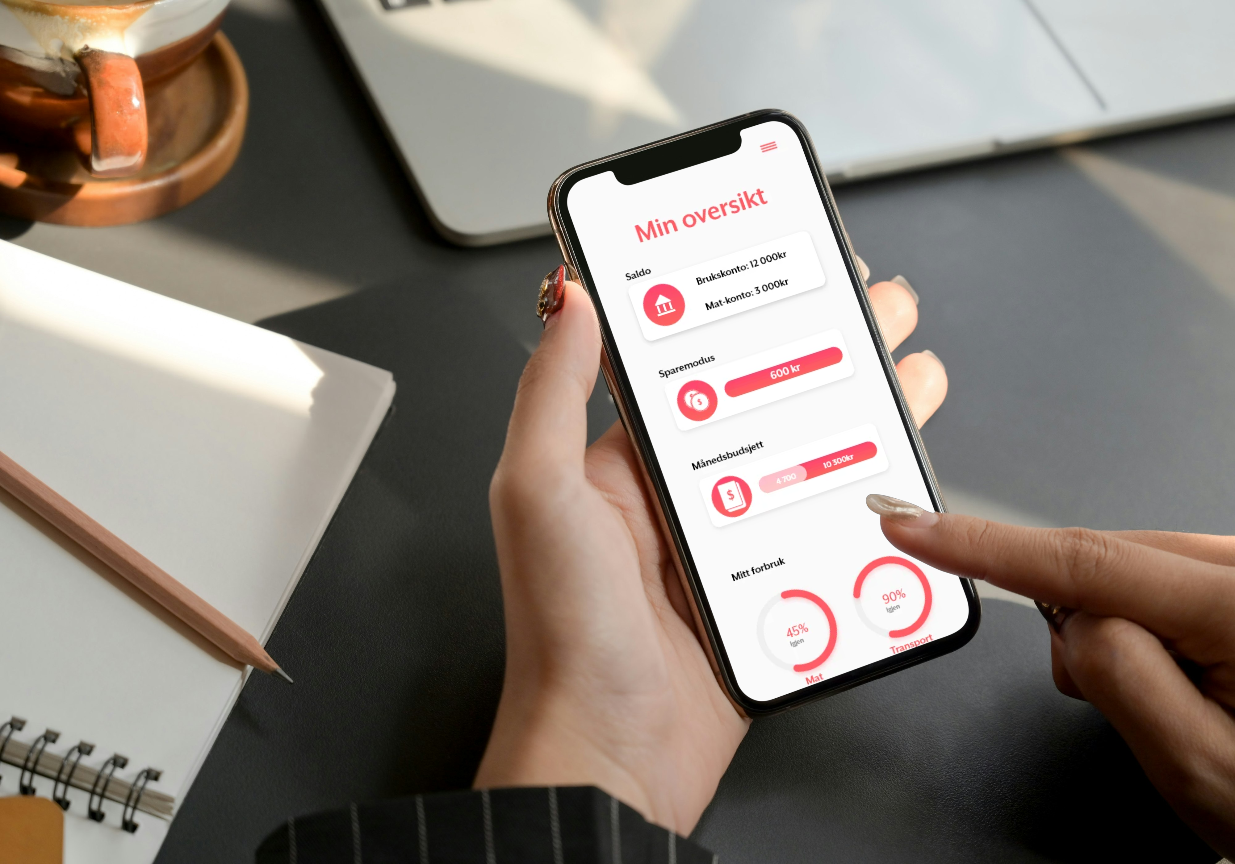
“My overview” shows account balances, savings mode, budget progress and spend by category, alongside the receipt scanner and its category filing.
What I learned
Insight first, assumptions last
Don’t design for yourself. Even as part of the target group, we were too few and too alike to be representative. Outside voices kept us honest.
Testing surprises you. Users noticed things we’d taken for granted, and the unexpected answers were often the most useful.
Questions are design too. A badly framed survey question gives unusable answers, writing clear ones turned out to be its own craft.
Want to see more of my UX work?
I’d love to talk about research, interaction design and turning insight into product.