Web design · E-commerce
Tan Store, an e-commerce redesign.
A mobile-first redesign of a Norwegian self-tan and makeup webshop, built to feel calmer and let the products do the talking.
The brief
Redesign a webshop, mobile first
With another student I redesigned tanstore.no, a Norwegian webshop selling self-tan products, makeup and accessories since 2016. Its dated look left a lot of room for a more modern, valuable experience.
The goal was a genuinely useful site grounded in user needs and accessibility, designed responsively for mobile, tablet and desktop with a mobile-first mindset.
Research & analysis
Finding the weak spots
The audience is mostly younger women, 16 to 35, interested in self-tan and makeup, so the redesign had to feel current, feminine and trustworthy.
Morville honeycomb, solving the site’s problems from a user’s perspective: needs, content organisation and personality.
Target-group interviews, three conversations on what shoppers look for and what creates friction.
Competitor benchmark, Blush, BliVakker, Eleven and Vita, mapping how to stand apart.
Wireframes
From whiteboard to grayscale
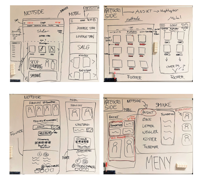
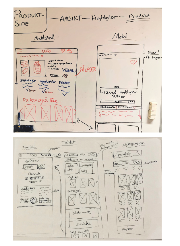
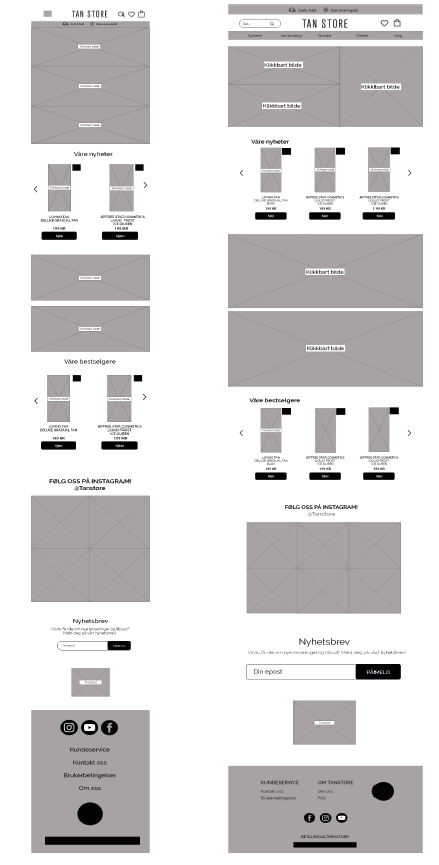
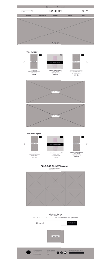
Early structure was sketched by hand on a whiteboard across desktop, mobile and tablet, then translated into grayscale wireframes for the homepage and category page before any visual design began.
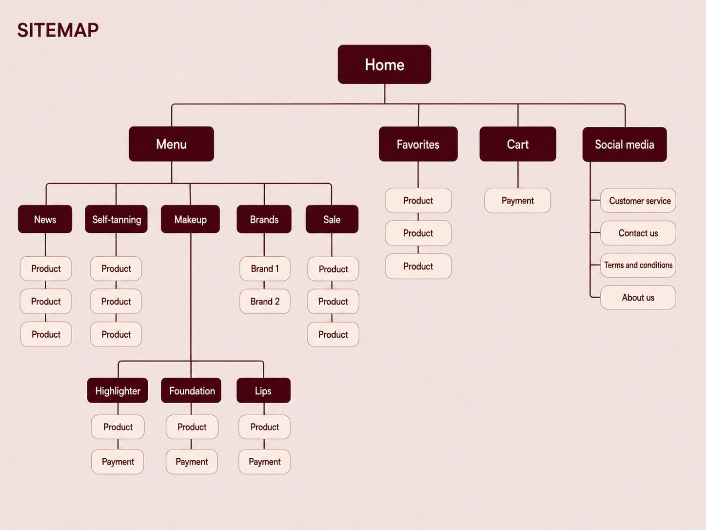
Sitemap
The site structure was mapped before wireframing to plan navigation depth and where product, cart and account flows would sit.
My direction
Standing out from the field
The group version sat too close to competitors and let the design crowd the products. Going solo, I took it somewhere calmer and more deliberate.
Product first, stripped the design back so it never competes with the products for attention.
Distinct colour, a muted, feminine tone that signals self-tan and sets the shop apart.
Responsive, adapted across desktop, tablet and mobile with a mobile-first approach.
Before & after
From loud and busy to calm and clear
New buy button, filled, minimal, contrasting cleanly with the rest of the page.
Favourite heart, an outline that fills with colour on tap, so saved products are easy to spot.
Sort & filter, placed and shaped so customers can narrow the range with ease.
Category visuals, image and type blocks give quick routes into Makeup and Self-tan.
The visual system
One muted tone, doing a lot of work
Tan mauve
Soft blush
Warm sand
Ink text
I tried many colours before landing on a muted tone that carries an association to self-tan and stays comfortable to look at over a whole shopping session.
Montserrat carries the type, friendly and easy to read, quiet enough that it never pulls focus from the products. Imagery was reshot in a calm, neutral style so makeup and self-tan read instantly.
The tone of voice is friendly and inviting, meant to leave shoppers wanting to come back, never shouting louder than it needs to.
The result
One shop, every screen
Reflection
Design that gets out of the way
A clear message, clearly framed. I’m happy the redesign communicates what Tan Store is in an obvious way, distinct from its competitors.
Feedback I chose to weigh. I got good input and set aside what didn’t fit my idea, but hearing it still made the work stronger.
Theory into practice. Working through web development and the Morville model gave me a better grasp of what it takes to make a good website.
Want to see more of my web & UX work?
I’d love to talk about e-commerce, responsive design and turning analysis into a usable site.